Max Temperature
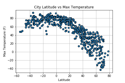
This scatter plot is interesting. We would expect to see what's shown graphically as we move along the x-axis from the right towards the equator. One might expect to see a similar shape moving from the left side of the x-axis towards the equator. Perhaps due to bias in the selection; or perhaps the temperature isn't as symmetric as one might think.
Visualizations